A little abstract, but relevant information on the topic of what kind of strange signs we have hanging in the VKontakte menu, as well as on one of the backgrounds on the site. In addition, we have already been asked questions about this. Go?
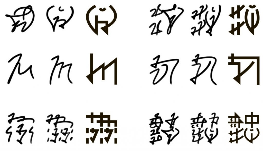
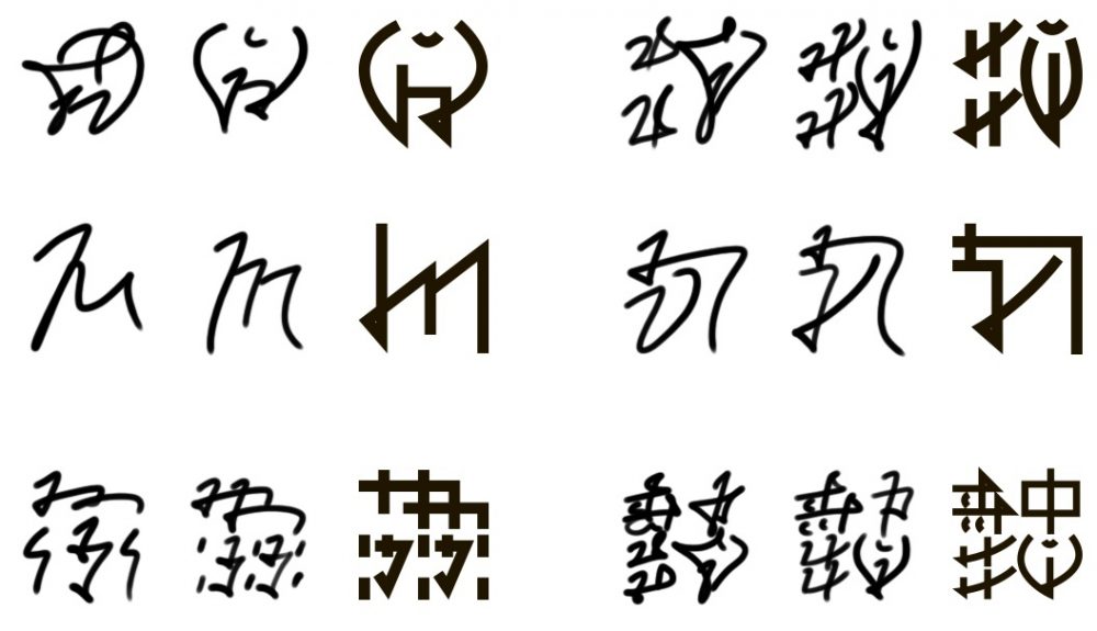
People who were interested in all sorts of antiquities probably understood and guessed a long time ago. That's right: this is Glinnar hieroglyphics - the same one that is already more than twelve thousand years old. It is now almost never used (which is a little sad), but this is the tenth thing. The question is, why are these styles so different from the usual ones with their straight lines and angularity?
The answer is quite interesting, to say the least. The fact is that the draghars, who communicated with the alves then a long time ago, thousands of years ago, really liked their hieroglyphs, and they decided to borrow a little of them for themselves. Already by that time, the Dragars had their own written language, which was also quite interesting (you can write a whole separate post about it), but it is not the writing itself that is important, but the material on which the Dragars wrote. It was quite exotic - molten stone.
With the fire they spewed, the draghars melted the stone to the state of soft clay, and then scratched squiggles on them with their claws. But it’s clear that this doesn’t make the claws any better either - and over time they began to use something like a thin metal spatula, rectangular in cross-section. And by the time the hieroglyphs were borrowed by the Dragars, styloses of this kind were used very widely - this is where the legs of these evenly angular outlines grow from.
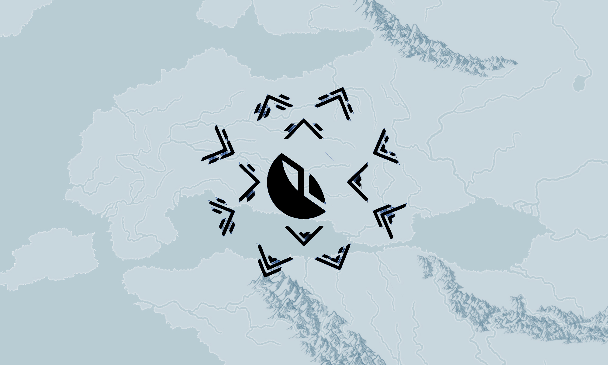
One of the caves, the walls of which are entirely covered with Alvian hieroglyphs, is located in Ruginia. Just fifty kilometers from Skaftos, by the way.
And in the image below I showed examples of the outline of some hieroglyphs. In the middle is the Alva “half-ustav” (“I don’t write the charter” because it takes a lot of time to draw, and I’m too lazy), on the left is a relatively careless cursive, and on the right is the Dragar style. From left to right, top to bottom: “fire”, “book”, “water”, “wind”, “thunderstorm”, “dictionary”; interpretation".