
Surely many of you have once and somewhere encountered inscriptions made in a strange vertical script, consisting of very similar vertical lines. A considerable number of you also know that this type of writing has been used by the Glinnar elves for countless years. But how does it work? This is what we will look at now!
Let's skip the history of its origin (most likely, it was created by Fodallein in some crazy 10100 BC) and go straight to the principles.
It is read from top to bottom and left to right; its main element is such a slash, as shown below.

Let's first understand how the signs corresponding to p, t and c (P, T, To). All of them... are written down by this single line!
Would this line be read as p, t or c, depends on its place of attachment to the previous element. p is attached below everything, t attached in the middle c is attached above everything. Of course, if a word begins with one of these consonants, there will be no previous element there, so a small extra hook is used to indicate the reading:

As you can see, p attached to the hook at the bottom, t - on the side of him, and c and is completely located partially above the hook. This should be clear; now let's see what happens if a word starts with a vowel a.

Everything is gradually starting to become clearer. The line without a hook with another thing on the right is a; The image above shows how the black line is read depending on where it is attached.
All other consonants work on a similar principle. For example, in the image below we can see readings for b, d, g.

The principle is still the same, only the upper part of the corresponding feature differs from that of the voiceless consonants shown earlier. It doesn’t seem that difficult, right? Ha, if only!
Firstly, we still have vowels left. With them everything is much simpler, for each of them there is a separate sign attached to the right to the previous element; if a word begins with a vowel, it is attached to an empty standard line, like a upstairs.

We also have f/ph, bh (f, V) th, dh (English) thin and this), ch, gh (X, rec. boohgalter). They all use the trait of their corresponding sound from plosives (p For f, c For ch...) with a small squiggle on the left:

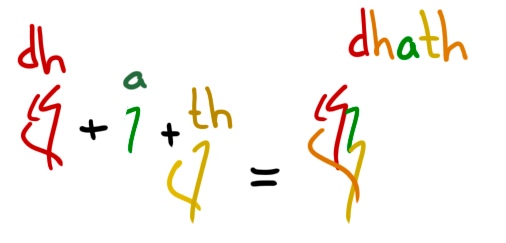
Now watch the trick.

Instead of writing a separate squiggle on dh and th, we simply connect them. And there are a lot of such ligatures and spellings; some of them are used almost always in writing, some almost never (only by certain authors). Here are two more examples for a better understanding:

And, as I already said, there are not two, or three, or even ten such ligatures. That is why this writing is so difficult to adequately represent in digital form (in Unicode, for example), and that is why modern Glinnarians prefer to use romanitsa in correspondence - it is read much more clearly than their madness, and is adequately presented in digital form .